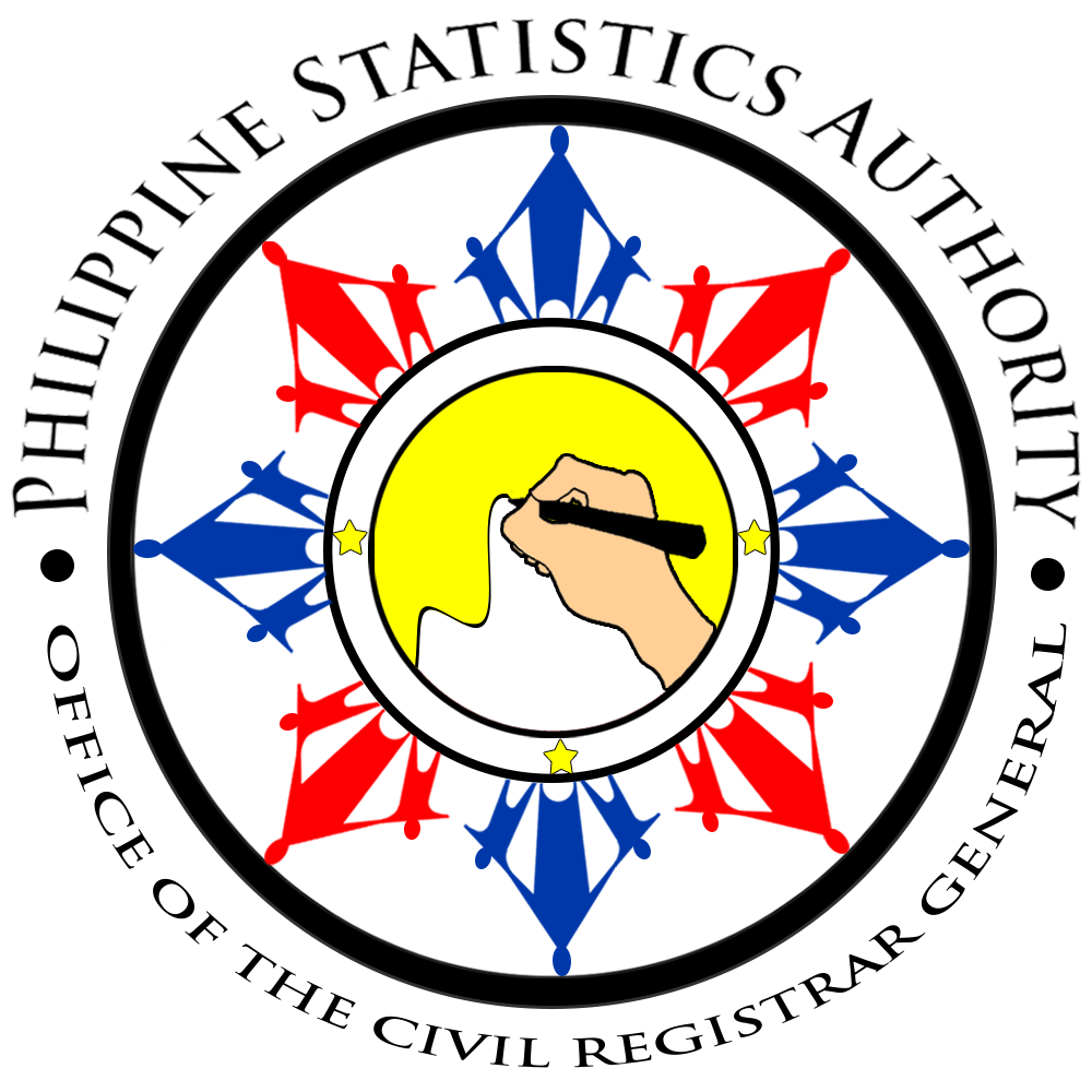
The concept of the new OCRG Logo was derived from the Philippine flag which was applied in the form and color scheme.
At the center of the logo is a hand that is writing that symbolizes the process of registration of significant events such as but not limited to birth, marriage, and death.
The line that was drawn by the hand symbolizes the rate of population or other vital records, and the efficiency of the civil registration system.
The colors of the core of the logo are yellow and white and reflect the left part of the Philippine flag.
The three stars symbolize the coverage of civil registration and vital statistics in the country: Luzon, Visayas, and Mindanao.
The eight long rays of the sun represent the eight provinces that had significant involvement in Philippine history.
The long rays come together with small rays to indicate that civil registration and vital statistics cater and respond to the needs and rights of the Filipino people for equitable development and improved quality of life for all.
These rays also feature a shape of a house and a family, the first and strongest unit of a community. The colors were based on the Philippine flag. Blue represents peace, truth and justice that Filipinos seek. Red connotes patriotism and valor, their most common characteristics.
The circle that encloses the logo is a confirmation of the security and safety of civil registry documents and the genuineness of vital statistics. It also signifies inclusion or belonginess in one nation as Filipino citizens.